
- Industry Print Operations
- Company Size 11-50
- Project Team
1 Full-stack Developer
3 Product Designers - Role I was the main driver behind the design system, continuously improving components in both Figma and the codebase. Together with my design colleagues, I worked on new and existing components and also tackled more complex areas like invoice email templates and system notifications, contributing as both designer and developer.
- Process The design system evolved through ongoing iteration. Whenever we identified inconsistencies, improvement opportunities, or the need for new patterns, we came together in focused jam sessions to align and refine components collaboratively.
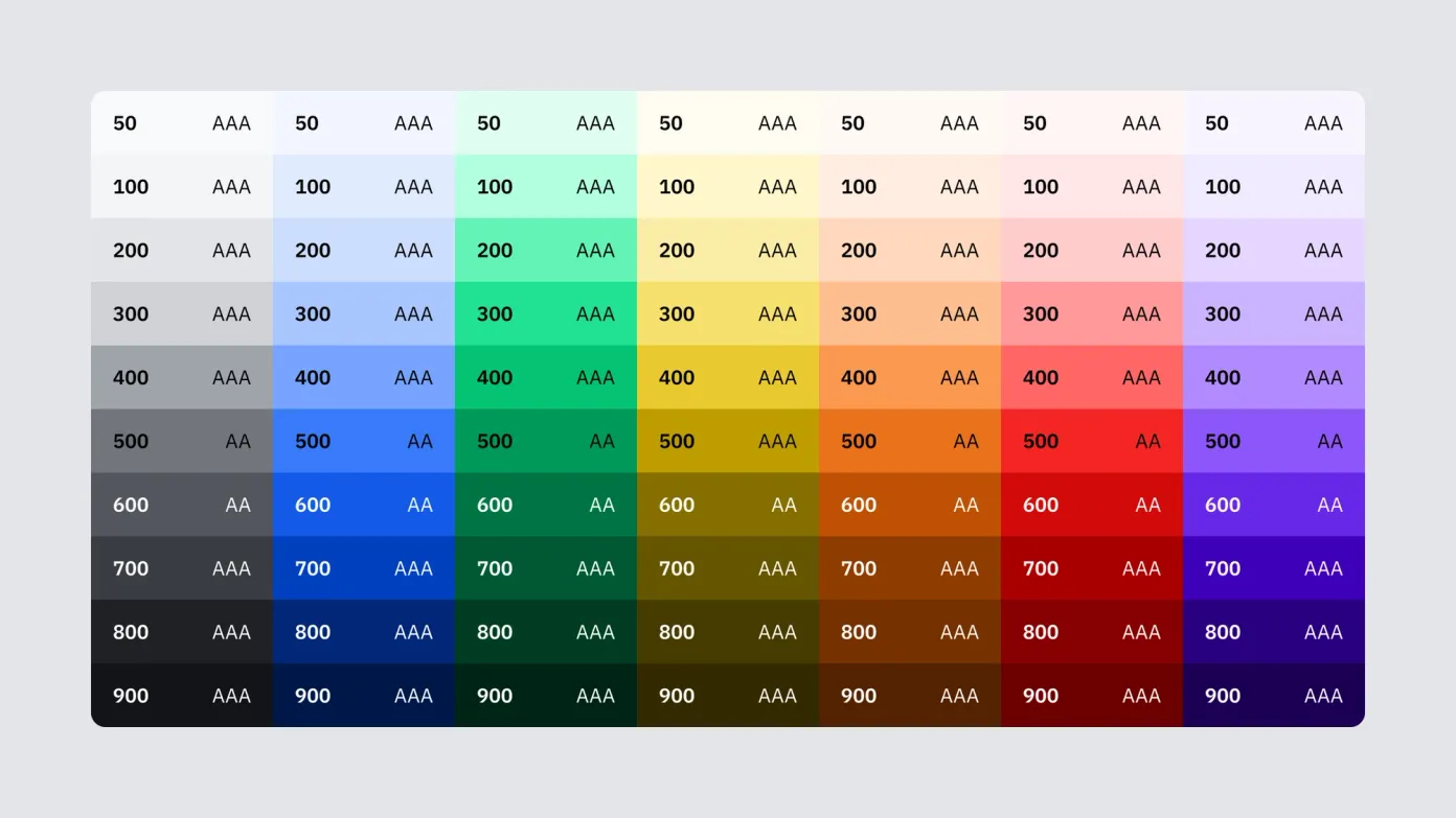
The Zaikio color system is carefully curated, each tone hand-selected to strike the right balance between function and personality. Opinionated by intention, the palette avoids the generic in favor of clarity, contrast, and character. Every color serves a purpose in the interface, whether it’s guiding focus, communicating state, or enhancing legibility. We rigorously tested each combination for accessibility, ensuring all pairings meet at least WCAG AA standards, with most achieving AAA compliance. To maintain visual consistency across light and dark modes, we designed a mirrored scale by flipping the 50-900 spectrum between themes while making nuanced adjustments for legibility and contrast. The result is a system that feels equally refined in both modes. The palette is also tightly aligned with Zaikio’s branding, creating a seamless bridge between product and marketing while reinforcing a strong, unified identity.
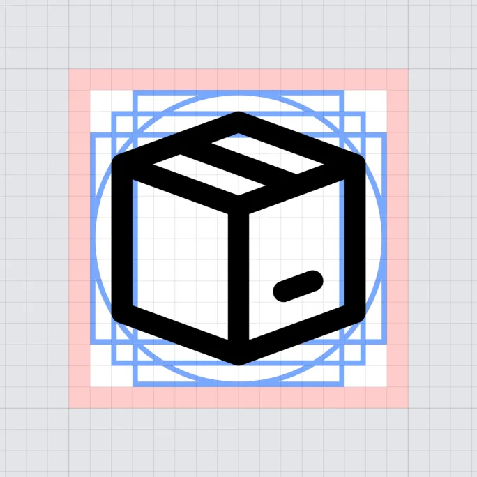
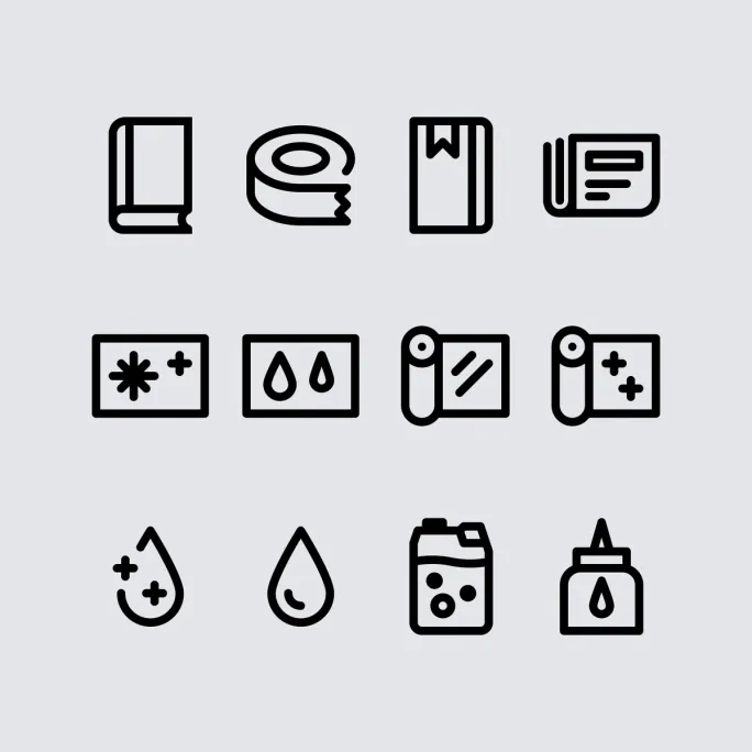

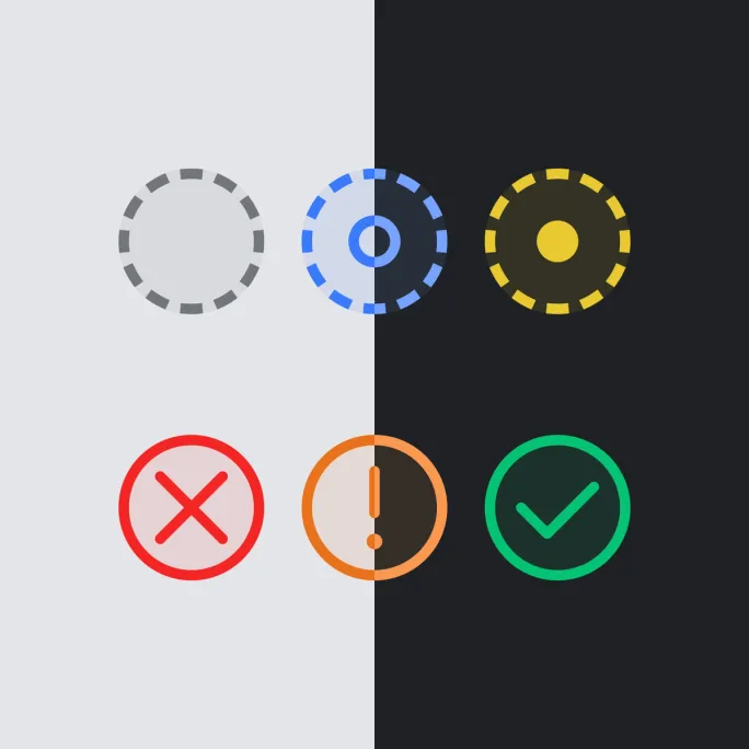
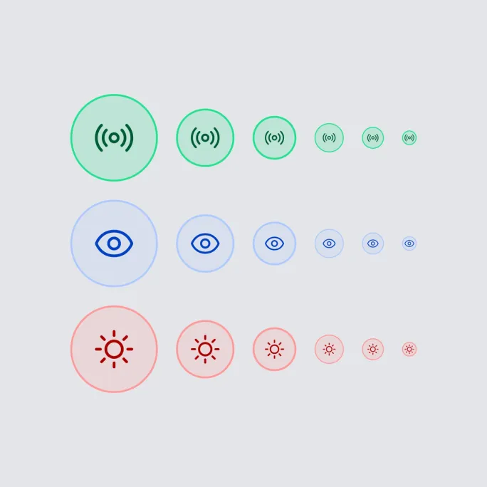
Every one of the 213 icons was meticulously handcrafted, with some even available in multiple weights. Using a consistent 16px grid system, we ensured each icon feels visually balanced and rhythmically aligned regardless of its shape or complexity. Our progress and status icons are built with a layered approach. A subtle background layer tints the icon’s base, adding depth and reinforcing meaning without overwhelming the interface. It’s a small detail that quietly enhances clarity. A key reason for creating a custom icon set was the need for deeply specialized visuals. In our world, a “book” isn’t just a book, it might be a hardcover, softcover, or defined by its material. Each variation benefits from its own icon, designed to speak the same visual language while reflecting real-world nuance.


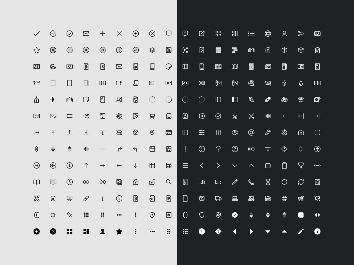
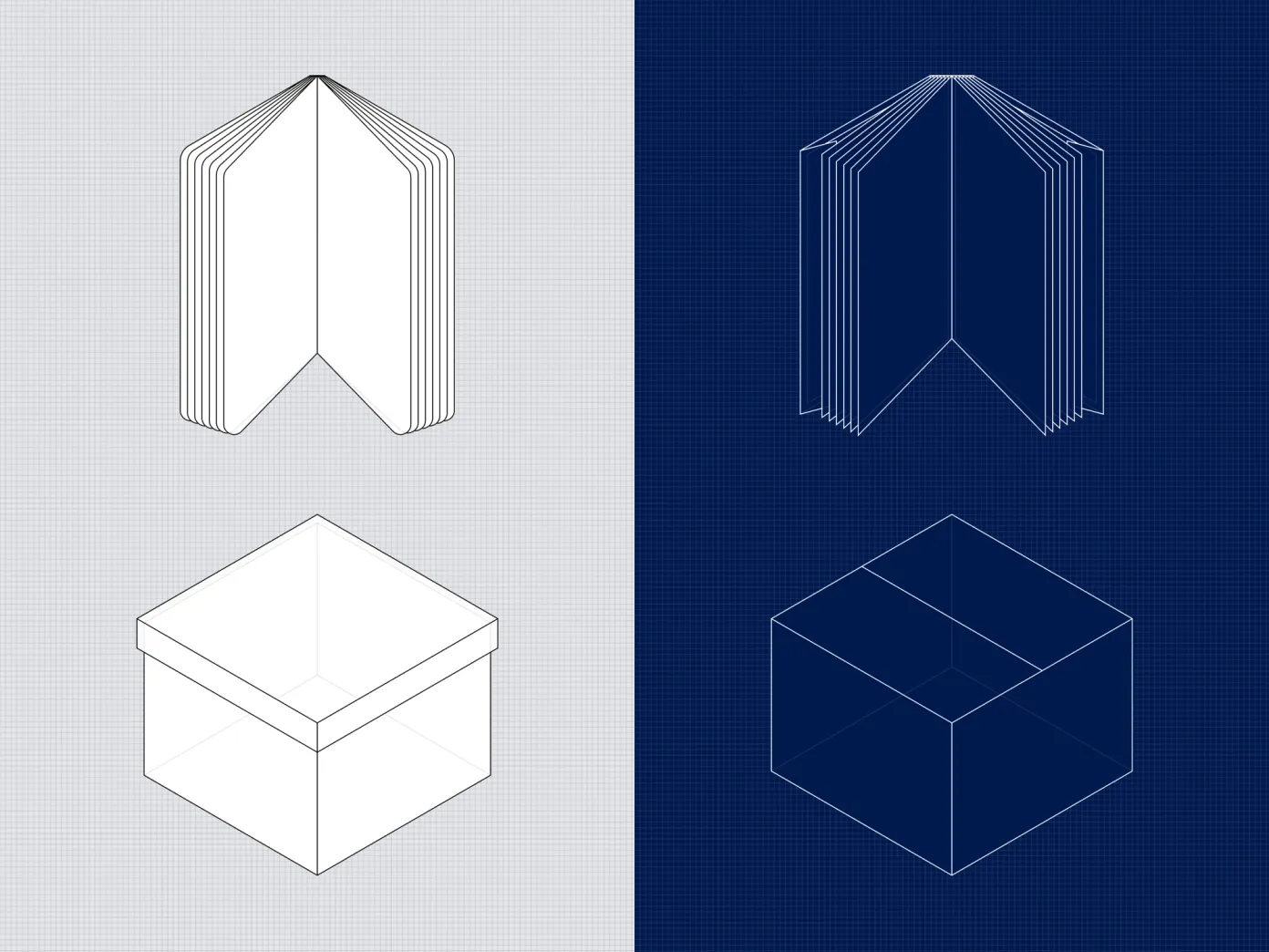
With hundreds of components, each crafted with intention and some offering up to 270 variants, the Zaikio Design System is built for precision at scale. Every icon is handmade, every color hand-picked, and every illustration is drawn from scratch, often with dynamic parts that adapt to context. 359 Components 213 Icons 26 Product illustrations 7 Color palettes